DIRECT IMPACT INTERNATIONAL
Branding History: Direct Impact International
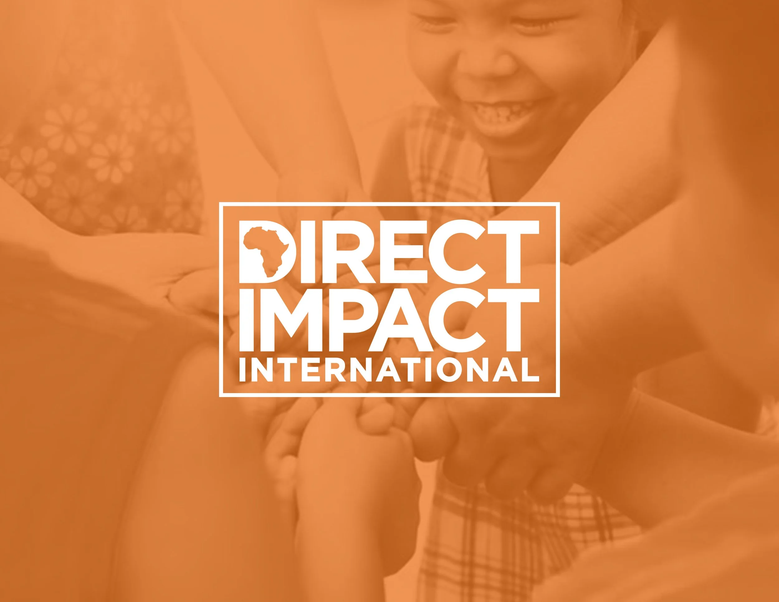
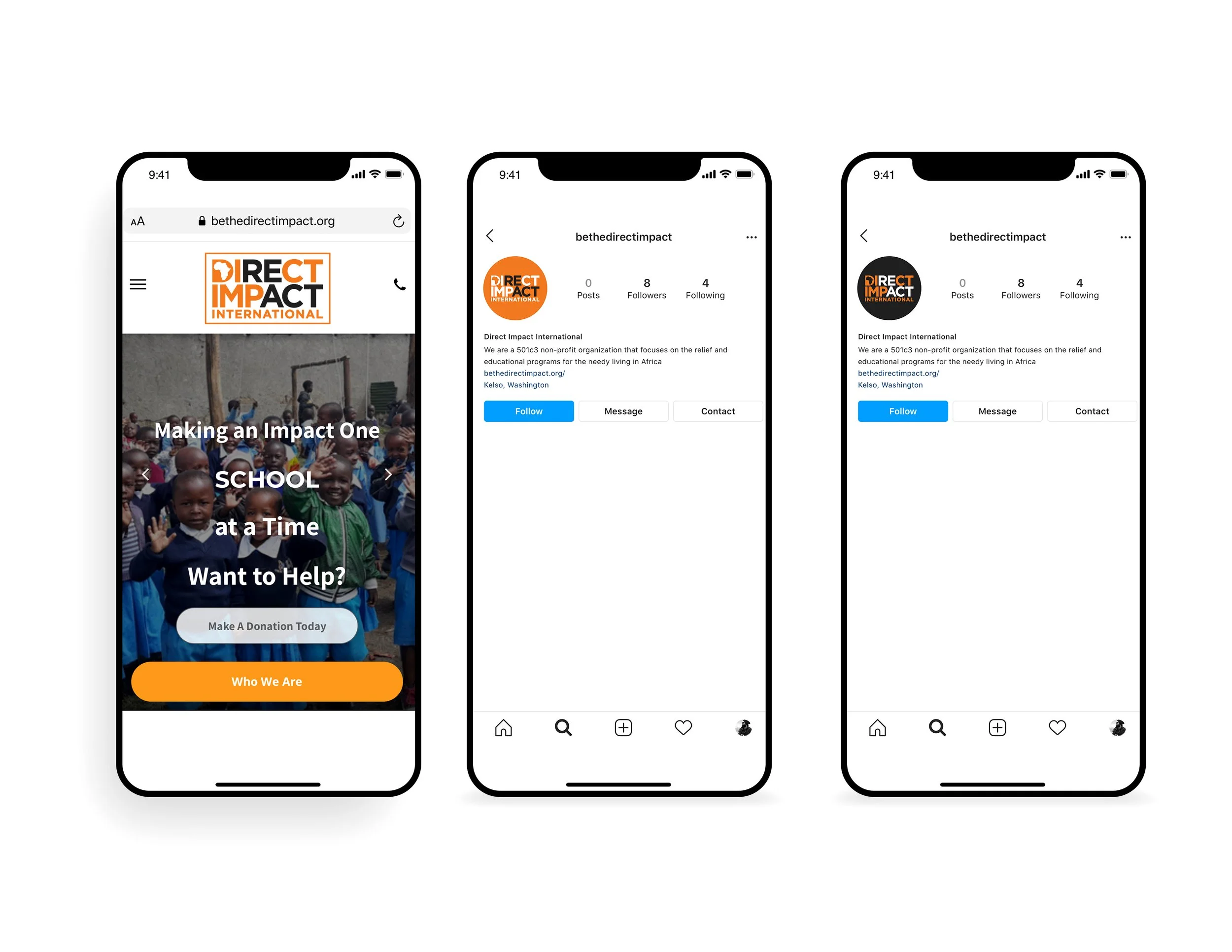
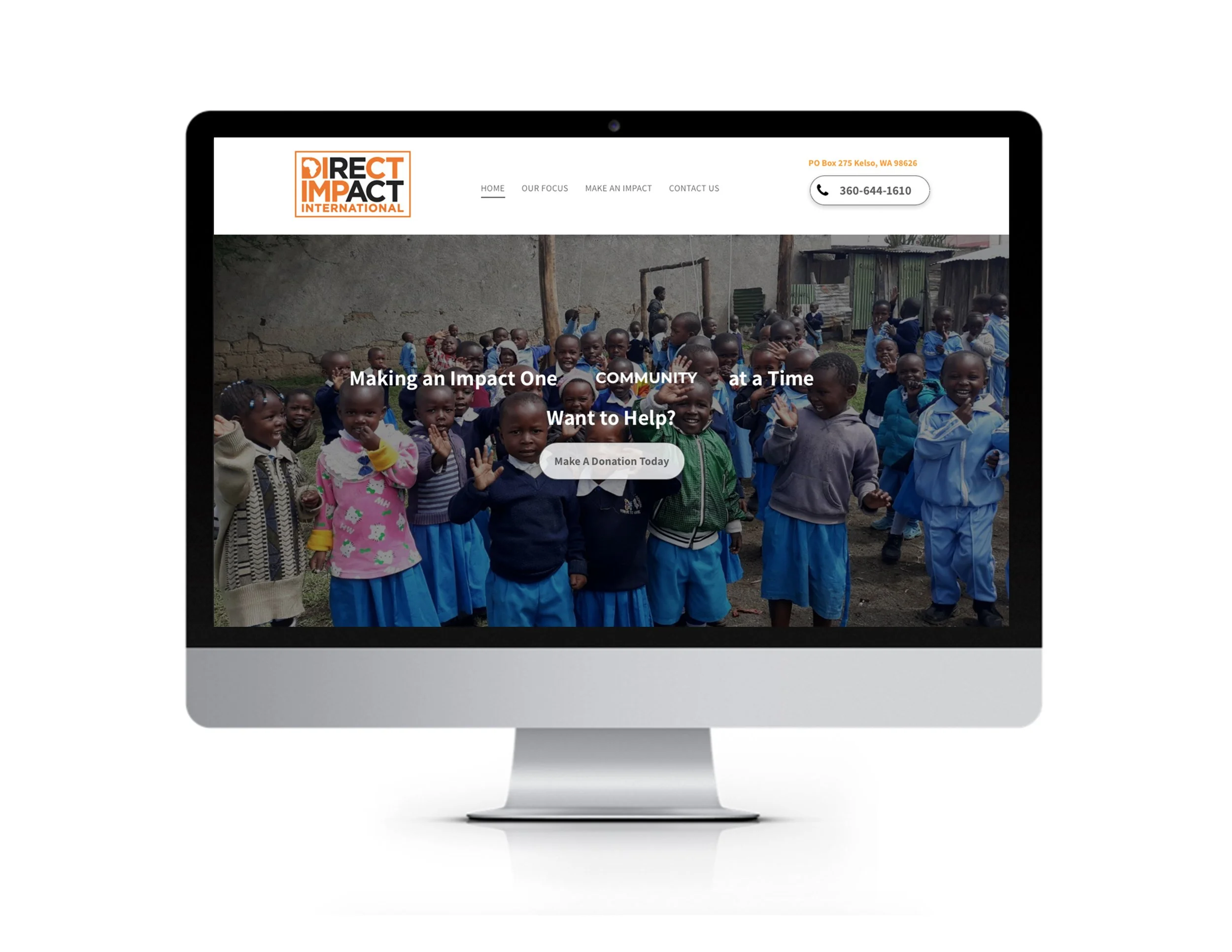
In collaboration with Direct Impact International, a 501c3 nonprofit dedicated to relief and educational programs across Africa, we embarked on a transformative branding journey to amplify their mission of empowering communities and fostering sustainable change.
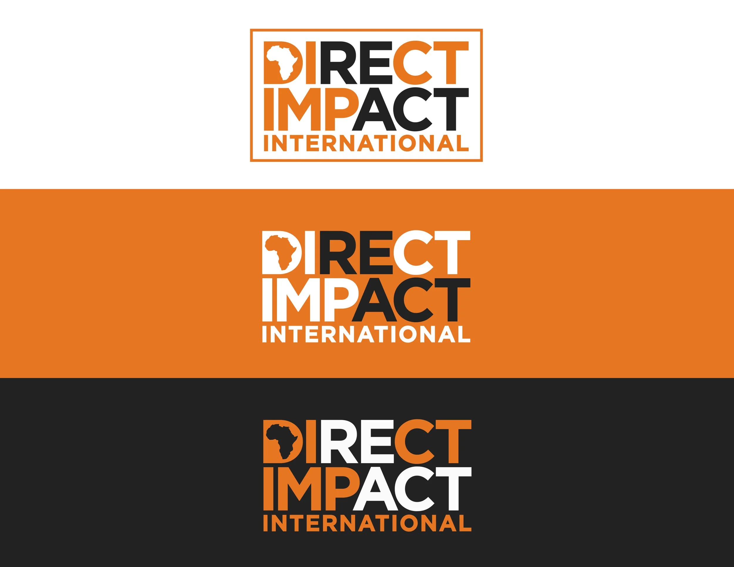
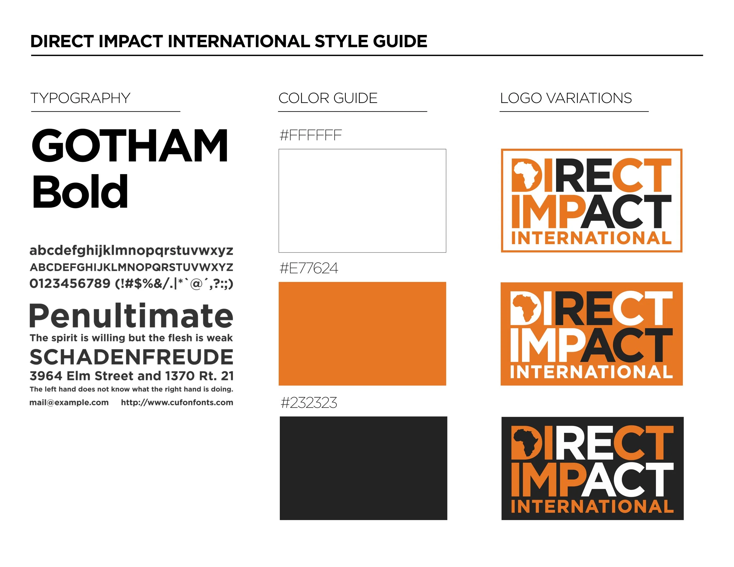
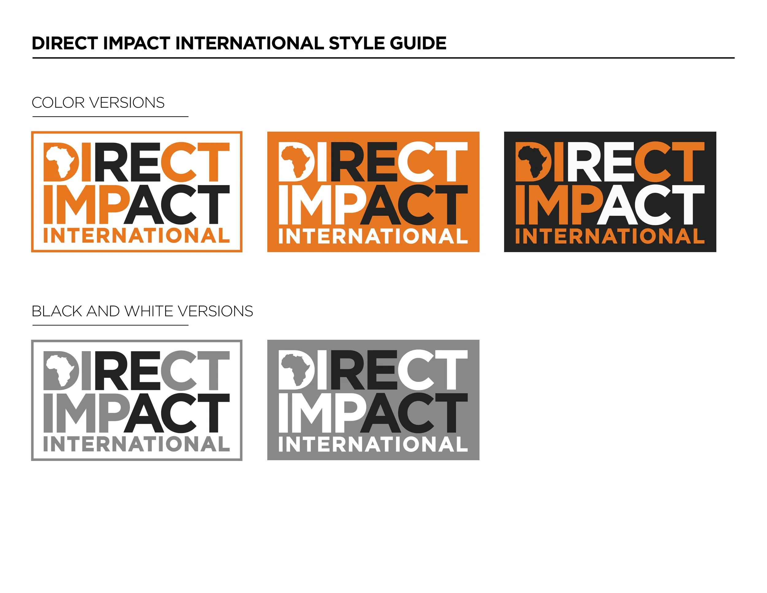
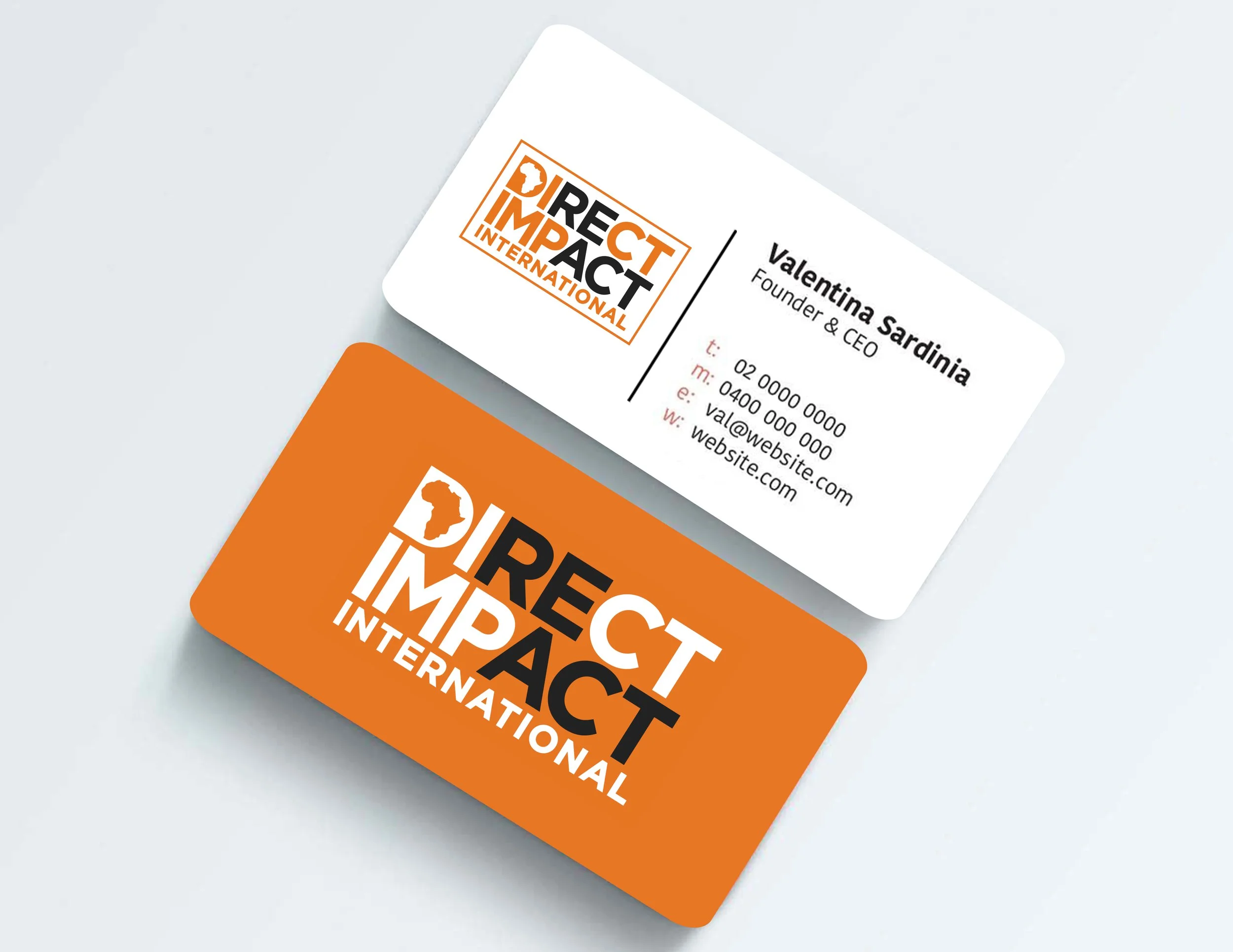
Logo & Visual Identity: We crafted a distinctive logo featuring the outline of Africa, symbolizing Direct Impact International's focus and commitment to the continent. Within the outline, a dynamic and forward-facing arrow signifies progress and empowerment. The color palette comprises deep orange, representing energy and initiative, alongside clean white for clarity and hope.
Typography & Design: A bold and modern typeface was meticulously chosen to convey strength and professionalism, ensuring clear communication of Direct Impact International's mission and values.
Business Collateral: The new business card design integrates the refreshed identity, emphasizing simplicity and effectiveness in every detail.
Through strategic branding, we've empowered Direct Impact International to enhance its presence and impact, resonating deeply with their values of Development, Accountability, Generosity, and Compassion. This cohesive identity now reflects their dedication to making a direct and meaningful impact across African communities.